


Want to bring your web designs to life? It all starts with the right wireframes. These unsung heroes of web design shape the website layout for every jaw-dropping digital experience.
To help you visualize this, we’ve gathered 22 stunning wireframe examples that show how these basic structures can evolve into beautiful, user-friendly websites and digital interfaces
Whether you’re sharpening your craft or just dipping your toes in, these wireframe examples will fuel your next big idea. Ready to design like a pro? Let’s dive in!
What is a Wireframe?
A wireframe is a simple drawing that shows what a website will look like and how it will work.
Think of it like a quick sketch for a website, app, or anything digital. It decides where buttons, text, and images will go, without worrying about colors or fancy designs yet.
In UX design, wireframes plan the structure and functionality of a site, ensuring a smooth user experience from the start.
Did you know 88% of people online leave a website if it’s confusing or hard to use?
A good wireframe keeps things clear and simple from the start, so users stay happy and stick around.
Why Wireframes Win?
Wireframing is like mapping out a road trip before you hit the road. It keeps everything on track.
Why’s it a win? It makes your website simple to use. It feels nice to visit. Without it, you get a mess. People will leave quickly - trust us.
Imagine a client says, “Add a shop part fast!”. Wireframes let you draw some ideas. Put buttons here. Move text there.
You find the best one fast - like crafting a killer logo in one draft.
Show it to clients. They say “yes.” You save time and money. No mistakes. Just a great website.
Low Fidelity Wireframes vs Mid Fidelity vs High Fidelity Wireframes: What’s the Difference?
Wireframes kickstart every standout website, but not all are created equal. They come in different levels of detail - low, mid, and high fidelity - each serving a different stage of the web design process.
Low Fidelity Wireframes are quick sketches. Simple shapes - boxes, lines - outline the website’s layout. No colors, no real text, just a basic structure for where buttons and images will go.
Why Use Them? Speed and flexibility. They’re perfect for brainstorming structure and refining UX design early in the process.
Mid Fidelity Wireframes are more detailed than low-fidelity ones. They add things like placeholder text, buttons, and menus, giving a better idea of layout and flow, but still don’t include full design elements.
Why Use Them? They help focus on how the site works and how users will interact, making it easier to make changes and get feedback before moving to the final design.
High Fidelity Wireframes take things up a notch. They include real content, precise spacing, and well-defined buttons and menus. Still no final colors, but they provide a near-complete picture of how the site will function.
Why Are They Essential? Precision. They fine-tune the details, giving clients and developers a crystal-clear preview before moving to full design and development.
Low Fidelity vs Mid Fidelity vs High Fidelity Wireframes
Low fidelity wireframes are great for quick ideas and early feedback.
Mid-fidelity wireframes sit right between rough sketches and detailed design mockups.
They show more layout and interaction details than low-fidelity wireframes, but they’re still not fully polished. You might see basic fonts and structure, but not the final colors or visuals yet.
High fidelity wireframes lock in details and enhance usability before the final build.

Wireframes, Mockups, Prototypes: What's the Difference?
Wireframes are basic sketches that show where things like buttons, text, and images will go on a website. They focus on layout and structure, not design.
Mockups are like static pictures of the design. They show what the website will look like with colors, fonts, and images, but you can't interact with them.
Prototypes are interactive versions of the design. You can click through them to see how the website or app will actually work.
In short, wireframes are the basic plan, mockups are the design, and prototypes let you try out how everything works.
How to Create a Wireframe: Simple Steps
Creating a wireframe is simple! Just follow these easy steps to plan your website’s design, a crucial part of the UX design process.
1. Plan It
Think about what your website needs to do and who will use it. Write down key sections, like the menu, homepage, or contact form.
2. Sketch the Layout
Grab a pencil or use wireframing tools. Draw a simple layout of the page. Focus on where the menu, content, and footer will go.
3. Add Simple Shapes
Use boxes and lines to show where buttons, text, and images will be. Don’t worry about colors or fonts—just focus on the layout.
4. Organize It
Make sure the website layout is neat and easy to follow. Check it’s simple to navigate.
5. Review and Adjust
Take a look at your wireframe. Does it work? Is everything in the right spot? Make any changes before moving on.
That’s it! Now you’ve got a wireframe ready to create a smooth, user-friendly website.
Wireframe Examples
Ready to see wireframes in action? These real-world examples show how simple sketches can shape stunning websites.
From quick low-fidelity layouts to detailed high-fidelity mockups, these wireframes are the stepping stones to smooth, user-first designs. Let’s take a look at how the pros do it.
Wireframe Sketches
Every great website begins with an idea, and handwritten wireframe sketches are the perfect way to bring that idea to life.
Whether you’re a seasoned designer or just starting out, there’s something magical about grabbing a pen and paper to sketch out your thoughts quickly. It’s raw, it’s real, and it beats staring at a blank screen every time.
Wireframe sketches can be as loose and wild as you need them to be, or crisp and detailed if that’s your style.

Take this one, for example: it’s simple, just a few quick lines and boxes, but the structure is already clear. Not overloaded with details, yet the layout is spot on.
That’s the beauty of a handwritten wireframe - your vision takes shape quickly and sets the foundation for a solid website design.
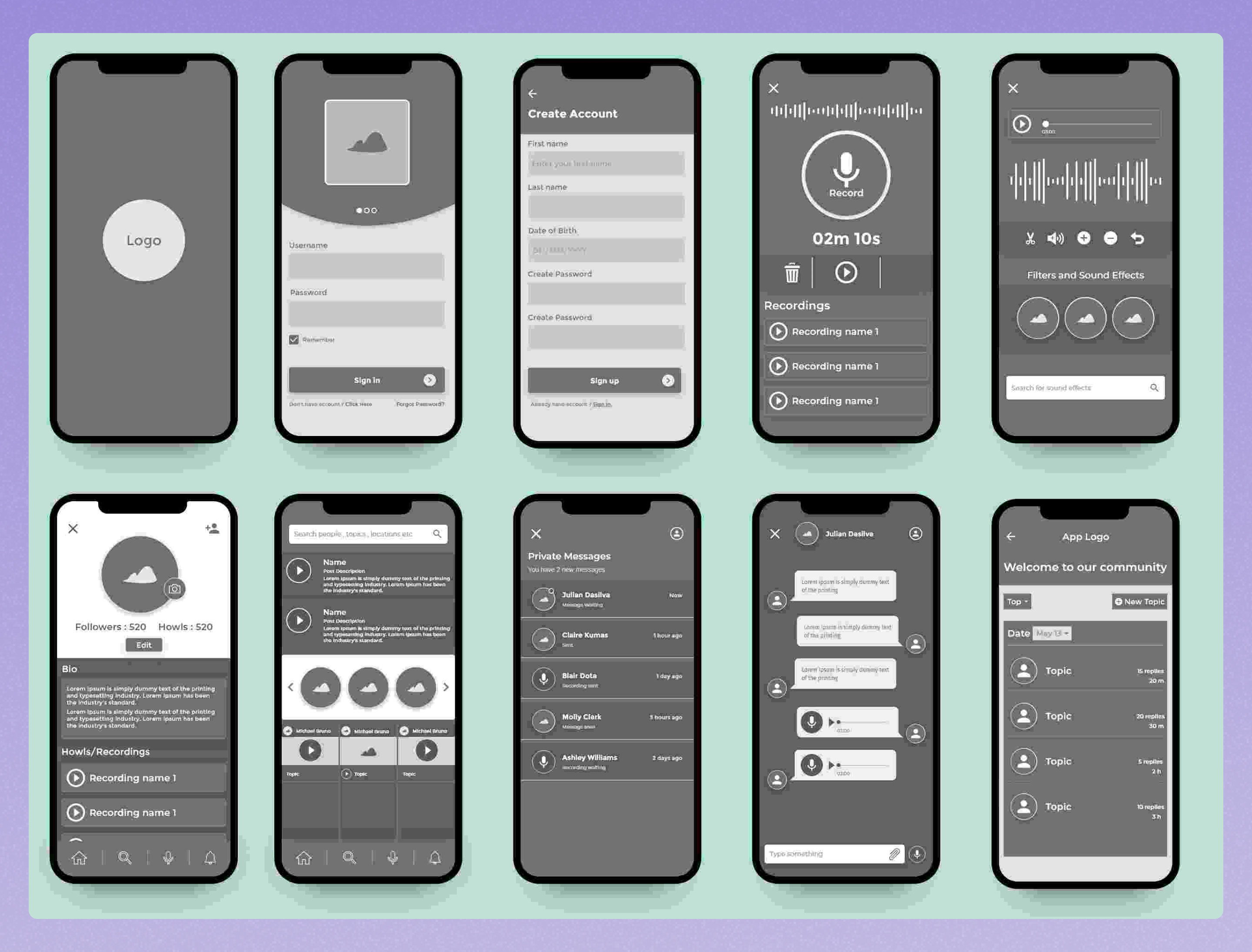
Low Fidelity Wireframe Examples
Low-fidelity wireframes can be hand-drawn or digital. The focus is on speed and layout, not details. Sketching by hand is great for quick ideas, while digital tools offer more polish and are easier for collaboration.
Here's an ideal wireframe example showing the layout of multiple pages for a website in a clean, digital format. It includes sections for products, customer reviews, services, and even a blog page.
Different shades of gray help show what’s most important. The grid keeps everything neat and organized, giving a clear idea of how the layout will work.

Low Fidelity Desktop Wireframe
A low-fidelity desktop wireframe is a basic layout for a desktop website, showing where elements like headers, menus, and content blocks will go.
It’s simple, quick, and helps map out the user experience before diving into finer details. Perfect for getting the structure right, without worrying about colors or fonts just yet.

Low-Fidelity Wireframe with Grid
This low-fidelity wireframe has a grid overlay that helps designers plan where each module and feature will go on the site.
It's not just useful for designers - it also helps stakeholders easily see what the final design will look like in real size.

Mobile App Low Fidelity Wireframe
Mobile app low-fidelity wireframes are simple sketches that show the basic layout and how users will navigate the app.
They help plan the app’s structure before adding colors or design details.

This sleek mobile app low-fi wireframe with a blue palette is simple yet elegant, perfect for apps like an audio player, weather tracker, or e-commerce site.
It features blocks for text or images, with key elements like product listings, categories, and a cart. The cart is shown, but not the main focus.
Users can view product details before adding it to the cart, then choose a payment method and complete the purchase.

Medium Fidelity Wireframe Examples
Mid-fidelity wireframes sit between low and high-fidelity designs. They add more detail than sketches, like some color, real text, and basic UI elements, but still lack full design elements. These wireframes help bridge the gap between abstract ideas and more concrete design plans.
They allow teams to start considering user interactions and navigation, while maintaining flexibility for changes. Mid-fi wireframes are great for testing and making quick changes. They are quick to create, making it easy to explore multiple design options and tweak them as needed.
If a design doesn’t work, it’s simple to adjust and try again without losing much time.

Homepage Mid-Fidelity Wireframe Example
This wireframe outlines the main layout of a website’s homepage. It shows where the logo, navigation, hero section, content blocks, and call-to-action buttons will go - helping define the overall user flow from the start.

Website Mid-Fidelity Wireframe Example
This mid-fidelity website wireframe example, designed by Michał Roszyk, showcases a thoughtful layout with partial content but no final visuals.
The design efficiently divides the page into distinct sections, with the header area ideal for showcasing key content, like a major sales pitch or featured article. The strategic use of white space ensures every element stands out, making the design visually appealing without overwhelming the viewer.

Hotel Website Mid-Fidelity Wireframe Example
This hotel brand website wireframe, created by Sean Taylor, is a great example of a mid-fidelity wireframe design.
It emphasizes the page’s content structure and flow, while also adding detailed notes in the margins for further clarity.

High Fidelity Wireframe Examples
As we mentioned above, a high-fidelity wireframe is a detailed, refined version of a wireframe that closely resembles the final design of a website or application.
High-fidelity wireframes can be part of both the UX and UI process — it depends on how far they go in terms of detail.
- In UX design, high-fidelity wireframes focus on structure, user flow, and functionality. They may include realistic spacing, real content, and interaction behavior — but still in grayscale or simple colors.
- When you add brand colors, images, typography, and styling, you’re stepping into UI territory — that’s more like a mockup or UI design file, not a UX wireframe anymore.
Here is an example of high fidelity wireframes for a mobile app:
Booking Wireframe Example
Justinmind’s travel booking wireframe presents an easy-to-use design, like your favorite apps. It has a clear search bar where users can quickly enter their destination, check-in and check-out dates, and number of guests.
The search results show hotels with important details like name, location, price per night, and a “View more” option for more information. The "Services" section also hints at extra features, like transportation or activities, to make the travel experience even better for users.

E-commerce Wireframe (Product Page) Example
A product page wireframe in e-commerce shows how items will be displayed to shoppers. It includes key elements like product images, name, price, description, and an “Add to Cart” button.
This layout helps focus on user flow and clear presentation before adding any final design details.
%20Example.jpg)
This great e-commerce wireframe example by Albert Girfanov is designed to handle the complex parts of an online store.
The layout is well-organized, making the checkout process easy and clear. You can purchase this wireframe on their website.
%20Example%202.jpg)
Landing Page Wireframe Example
This landing page wireframe by designer Zahid Hasan Zisan takes a clean and minimal approach, leaving visual details to focus purely on structure. Its simple layout highlights a well-organized landing page, with neatly placed text sections and a clear top navigation bar.
The generous use of whitespace makes the design easy to scan and gives each element room to breathe—an effective and thoughtful use of space.

High Fidelity Wireframes for a SaaS B2B
This high fidelity wireframe features a bold headline, sample text, and a clear "Sign Up For Free" button, emphasizing user onboarding and driving conversions.
It also showcases a dashboard preview and key feature highlights, making it easier for non-designer stakeholders to visualize how the app will function and appear after launch.

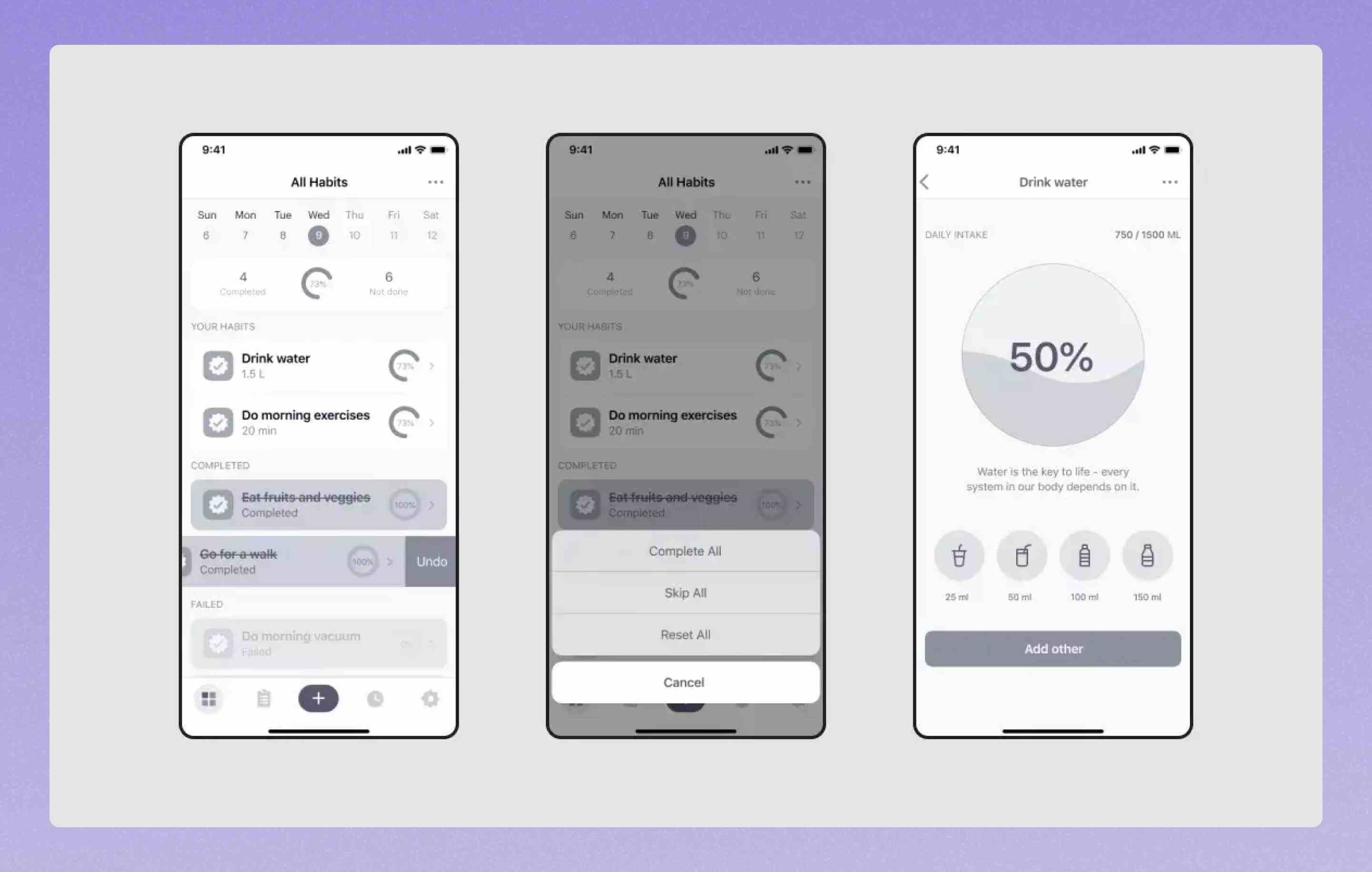
High Fidelity Mobile Wireframes
These high-fidelity mobile app wireframes showcase the detailed layout and structure of a mobile app interface. It features clearly defined components like navigation menus, buttons, and input fields that reflect the intended user interactions.
The design closely mirrors the final product, offering a realistic preview of the app’s functionality and flow.
High-fidelity Wireframes Examples Using One Highlight Color
High-fidelity wireframes that use a single highlight color strike a clean balance between structure and style. They keep most of the layout in grayscale, but use one bold color to draw attention to key elements like CTAs or navigation.
It’s a simple, smart way to show hierarchy without going full-on visual design.

In this example, Designer Reiss crafted this high-fidelity wireframe for a sports mobile app. It’s a solid example of how wireframes can include real text and a touch of color to bring the layout to life before moving into the prototype phase.
The wireframe clearly shows the navigation elements and key parts of the product layout. It’s clean, easy to follow, and does exactly what it needs - no extra fluff.
Wireframe For A Marketing Agency's Homepage
This great wireframe, shared by UX designer Sergei Pikin on Dribbble, shows a homepage for a digital marketing agency. It includes real content, icons, and logos, with color used to organize and separate sections.
While it doesn't have real images yet, the wireframe gives us a clear idea of the site's layout, including a simple navigation bar that shows how users will move through the site without being too busy.

Settings Page Wireframe Example
This wireframe by Steve Schoger shows how to organize a lot of information in a simple way. The settings page is divided into categories on the left and details on the right, with icons and descriptions to help users find what they need.
The account page form is easy to read, with clear labels and enough space between elements to keep everything neat and simple.

Tesla Dashboard Wireframe
Designing a smart car dashboard wireframe requires clarity and functionality above all. This wireframe by Louis does a great job at presenting key driving and vehicle info in a way that’s easy to read with minimal distraction.
It’s a high-fidelity example that makes smart use of space and organizes features in a clean, intuitive layout.

Smart Dashboard Wireframe
Naga Shiva’s smart dashboard wireframe is a great example of clean, organized content layout. With a left-hand navigation menu and well-separated sections on the right, it presents information in a way that’s easy to follow and simple to navigate.
Everything has its place, helping users quickly find what they need.

Best Free Tools for Website Wireframing
Seriously, there are so many wireframing tools these days, so picking the right one for your project is actually a pretty big deal for how your design goes.
So if you're ready to start building your wireframe and want to explore some excellent free options, here are a few of our favorite tools to get you started:
- Miro
Miro is a well-known and popular tool for collaborating on wireframes. It's pretty easy to use and accessible for multiple team members.
- Adobe XD:
Adobe XD has a ton of great wireframe templates for beginners and expert designers alike.
- Figma:
Another collaborative interface design platform that helps teams create wireframes together. Figma has some cool user flow and decision-tree features that are simple and well-visualized.
- Wireframe.cc:
A super simple grid wireframe tool that will literally have you building wireframes on the website's homepage. Super simple to get started on.
Final Words
To wrap things up, starting with wireframing before jumping straight into prototyping is a smart approach.
We all know how hard it can be to find that spark of inspiration at the beginning of a project.
But with the right wireframe examples for web and mobile apps, you'll have a solid foundation to guide your design process.
Whether it's refining your layout or exploring different user interactions, these wireframe examples we just discussed will help shape your next project and get you on the right track!


.jpg)
